Quantcast
Channel: ComponentSource News | Chart Components
Viewing all 2893 articles
Browse latest View live

Telerik UI for Xamarin R2 2019

$
0
0
Image Editor control for Telerik UI for Xamarin.

Includes new Map, Image Editor & PDFProcessing controls, plus enhances PDFViewer.

Features

  • General
    • Introduced Map control. Provides visualization of ESRI shapefiles that consist of geometric objects, such as lines, polylines and polygons.
    • Introduced Image Editor control. Enables you to easily visualize and edit images in different file formats in your mobile application.
    • PDF Viewer is now official.
    • Introduced RadPdfProcessing library. It allows creation, import and export of PDF documents.
  • Common
    • Upgraded to Xamarin.Forms version 3.6.0.264807.
  • Accordion
    • Expose CornerRadius for AccordionItem and AccordionItemHeader.
  • Calendar
    • Add multiple and range selection modes.
  • DataGrid
    • Add support for expanding/collapsing groups programmatically.
  • PDF Viewer
    • Added Read-On-Demand functionality that allows for faster initialload of a Document as each page is loaded on demand.
  • Visual Studio 2019 for Mac
    • Adds support for the menu and toolbox for Telerik UI for Xamarin when you develop on Microsoft Visual Studio 2019 for Mac.

Fixes

  • Common
    • RadAutoComplete is obsolete as of version R2 2019. Please use RadAutoCompleteView instead.
  • AutoCompleteView
    • [iOS] SuggestionView isn't shown correctly in Right-To-Left flow direction.
  • Calendar
    • TimeSlotTapped event reports wrong time when tapping on the last time slot.
  • DataGrid
    • [UWP] MissingFieldException occurs when clicking the options button with Xamarin.Forms 3.5.
  • ListView
    • [iOS] When a button is placed inside the HeaderTemplate after a certain position, its click event is not raised.
    • [Android] When using TemplateSelector sometimes the items are displayed with the wrong content.
    • [UWP] The control cannot render static properties.
  • PDF Viewer
    • NavigateToPageCommand does not accept int as command parameter.
    • ZoomLevel is not properly set after switching form single to continuous layout mode after being zoomed in or out.
    • Exception is thrown when switching tabs in RadTabView.
  • Popup
    • Popup is not centered on a UWP device with display scaling different from 100%.

Telerik UI for ASP.NET AJAX R2 2019

$
0
0
New confirm dialog in RadButton.

Includes enhancements & new themes for RadMultiColumnComboBox, plus new Confirm Dialog in RadButton.

Features

  • Common
    • Improve performance for resolving the default Classic RenderMode under heavy load.
    • Backport minor jQuery vulnerability fix: Object.prototype pollution.
    • The NuGet installer now installs the Telerik.Web.Design.dll.
    • The Telerik NuGet server provides nugets for the Latest Internal Builds.
  • Button
    • Confirm dialog in RadButton.
  • Calendar
    • RadMonthYearPicker was added to the SkinManager's ControlTypeToApplyskin collection.
  • Grid
    • New GenerateXlsxOutput method to generate the ExportOutput for Excel XLSX exporting.
  • MultiColumnComboBox
    • New MuliColumnComboBox skins.
    • Design-time support.
    • Add SelectedIndexChanged and ItemDataBound server-side events.
    • Add Schema configuration for improved web service binding.
    • Improved compatibility with field validators.
    • Improved control over additional items data sent from the server.
    • Ability to trigger postback when AutoPostBack=true.
    • Support for Server-side Items creation.
    • Add various Find methods for Items collection.
  • SpreadProcessing
    • Provided API for enforcing the use of only FIPS 140-2 complaint hashing algorithms.
    • Added support for Line series charts with Markers - they can be created with charts dialog, in code, or from xlsx file import.
    • Added support for Scatter and Bubble charts - they can be created with Charts Dialog, in code, or via import from xlsx file.

Fixes

  • AsyncUpload
    • When the ChunkSize is set the excel files are partially uploaded.
    • Last Modified Date is wrong for files uploaded in Firefox 61+.
  • Button
    • Text is not aligned against the icon for radio buttons and checkboxes.
  • Diagram
    • html5window.js should require html5popup.js to be loaded - Uncaught TypeError: Cannot read property 'TabKeyTrap' of undefined.
  • Editor
    • No resizing handles for image and table elements with Firefox 63+.
    • M.enableContextMenus in not a function error on mobile with enableEditing(false).
    • onParentNodeChanged() causes a Cannot read property defaultView of undefined error in Chrome 73.
    • Under IE when you right click on a hyperlink and select Properties instead of Link Properties you get Image Properties dialog.
    • z.push is not a function error is thrown when pasting malformed Word lists.
    • In Chrome the getSelectedElement() function returns a [body] tag when an [input type='number'] is selected.
    • Editor does not convert rgb to hex in MS Edge when converting from to.
    • Extra Lines on Enter key press in Firefox when RadEditor is placed in a not initially selected RadWizard step.
    • The editor commands do not work when the editor is initially hidden in IE11.
    • The image manager is incorrectly resized in Chrome, FF, IE11.
    • Ribbon bar drop down menus cut off when toolbar mode set to anything other than RibbonBar.
    • Fix InsertImage, InsertLink, InsertTableLight layout improvements.
    • Code snippets coming after remove table style from insert table popup.
  • Grid
    • Fix RadGrid delete confirmation does not work on new version of Chrome 73+.
    • RadGrid Keyboard navigation does not work in Firefox 65.0.1.
  • Input
    • Page hangs sometimes when continuously entering input fast in MaskedTextBox in Edge 41.
    • Change value by mousewheel does not work in Edge.
  • MultiColumnComboBox
    • A JS error is thrown when EnableScritptsCombine is set to false.
  • PdfProcessing
    • ArgumentException is thrown when importing FormFields several times.
    • InvalidOperationException is thrown when importing document with missing EOF marker.
  • SpreadProcessing
    • ArgumentException is thrown when importing documents containing empty values.
    • Round function returns different values than excel.
    • Changing the format of cells which hold the values for the value axis does not redraw the chart.
    • NullReferenceException is thrown when pasting in a protected sheet.
    • Print/PrintPreview displays charts in an incorrect arrange location.
    • VerificationException (operation could destabilize the runtime) is thrown in VS 2019.
  • Wizard
    • RadWizard Button triangle edge is slightly moved to the right.
  • WordsProcessing
    • UriFormatException is thrown when importing HTML content containing embedded images with leading white spaces.

Telerik DevCraft UI R2 2019

$
0
0
Telerik DevCraft UI

New controls, features and themes across web, mobile and desktop for both .NET and JavaScript developers.

Features

Telerik DevCraft UI R2 2019 release includes the following updates:

Telerik DevCraft Complete R2 2019

$
0
0
Telerik DevCraft Complete

New controls, features and themes across web, mobile and desktop for both .NET and JavaScript developers.

Features

Telerik DevCraft Complete R2 2019 release includes the following updates:

Telerik DevCraft Ultimate R2 2019

$
0
0
Telerik DevCraft Ultimate

New controls, features and themes across web, mobile and desktop for both .NET and JavaScript developers.

Features

Telerik DevCraft Ultimate R2 2019 release includes the following updates:

JSCharting 2.8

$
0
0
Axis, Accessibility, Data Grid, and much more

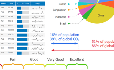
JavaScript charts for developers. Latest release adds Axis Range Ticks, a new Datagrid control & Line Caps.

Features

Reimagining the Axis

  • Axis Range Ticks - 'Range ticks' may sound contradictory at first, but they are a powerful new addition for axis labeling. Axis ticks traditionally refer to a specific point on an axis scale; however, now have gained the ability to define a range. Simply specify an array of two numeric values in place of a single numeric tick value to enable the range axis tick visualization. Range ticks can display with three different visualization styles and will select the optimal mode automatically while also allowing for manual configuration.
  • AxisTick CalendarPattern Values - Combining CalendarPatterns with axis range ticks provides a new and compelling way to visualize time scales. Enabling range ticks to be automatically drawn for every month, quarter, year (or any other interval) is as simple as adding one line of code.
  • AxisMarker CalendarPattern Values - CalendarPatterns are a powerful shorthand API enabling you to define complex date patterns (such as rules for national holidays) or interval based patterns (such as weekends). These patterns can now be specified as axis marker values to mark important dates that may correlate with your data.
  • Category Scale Names == Ranges - JSCharting v2.8 introduces a new concept for category scales. String category names no longer refer to a single point on an axis, but rather a range. AxisTicks and AxisMarkers now accept either category name values or two category names that refer to a range that encompasses both categories.
  • Logarithmic Scale Improvements - Logarithmic scales now support zero and negative values. In addition, exponent format string 't' support is now available to shorten the large numeric axis values that often appear in logarithmic scales.
  • Point Axis Ticks - This feature automates complex coding tasks through a very simple API. A xAxisTick or yAxisTick property can be set directly on any data point (or the default) configuration object which adds an axis tick bound to point itself. The value of this tick will automatically be set to the point value and the tick label includes seamless support for point tokens that describe the point.
  • Axis.caOffset property - The addition of range tick visualizations introduce a powerful new tool to describe sections of a scale. An axis that includes these visuals can now be positioned inside the ChartArea (negative px offset) or to a specific position outside the ChartArea (positive px offset) to gain more control of range and value tick layout.
  • Axis Number Shortening and Magnitude Formatting - Large numeric values, which take time to read accurately, waste a lot of screen real estate.. Now, the axis can automatically shorten these values so that 56,000 turns into 56 k, 1,000,000 becomes 1M and so on. This formatting option is also available as the 'a' format string and can be used with any labels outside the axis. When a number is added to the format string such as 'a2', it refers to a specific magnitude.

Introducing the Datagrid

  • Datagrid Control - Version 2.8 introduces a powerful and tightly integrated data grid that binds to JSCharting charts and also acts as a stand-alone grid connected directly to your data.
  • Microchart and Icon Syntax - The simple syntax that allows microcharts to be added to any label on a chart is also supported in datagrid cells. In addition, JSC’s icon syntax provides access to the full library of icons for seamless usage in datagrid cells.
  • Token Formatting and Expressions - The same formatting and expressions syntax supported within chart labels can now be used to define data grid column values.
  • Chart to Datagrid - An existing chart can show an alternative data grid of the charted data by simply setting the datagrid_enabled config option to true. A chart can also populate any div on the page with its data using the chart.toGrid('divId') function.
  • Export to CSV - When the datagrid CSV export option is enabled, a convenient button is generated that will save the data as a CSV file on the client's computer.
  • Tooling Harmony and Automation - The recent enhancements and support for delimiter separated value formats such as CSV can now plug directly into stand-alone data grids. This powerful combination can automatically detect CSV headers and interpret data to display the results as intended without intervention or additional manual settings.

More Features

  • Accessibility - Whether your organization must comply with section 508 or WCAG 2.0, you now have access to all the options to enable and control your chart accessibility experience. In addition, color palettes optimized for color impaired viewers have been added to further enhance accessibility regardless of the specific form of color impairment.
  • Gantt Dependencies - The advanced Gantt chart capability of JSCharting is now even more powerful. Project task dependencies for critical path analysis can now be visualized on Gantt charts. Starting tasks can be set to depend on the completion of another task or a number of other tasks as a group.
  • Line Caps - Line caps add deeper meaning and context to ordinary lines by communicating line direction, colors and symbols. Line Caps are automatically set to enhance visualizations such as Gantt dependencies and range ticks and can also be set for other lines on the chart (even on line series).
  • Superscript and Subscript - Superscript and subscript text is useful for many advanced labeling needs and avoids having math equations or numeric values written as 10^5. Both superscript and subscript html tags can now be used with any labels in JSCharting and will correctly render as SVG text.
  • Updated Microchart Styling and Options - Microcharts have been enhanced with a clean and modern look. Additionally, a rotate option has been introduced which is useful for custom fit and rotation requirements as well as rendering microcharts stacked horizontally or vertically across axis ticks.
  • Other
    • Scroll panel on calendar cells labels that don't fit.
    • Scale column labels to fit vertically when autoHide=false.
    • JSC.label() icon animations.

Nevron Vision for .NET 2019.1

$
0
0
Nevron Vision for .NET

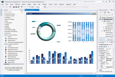
Adds support for Microsoft Visual Studio 2019.

Features

  • Support for Visual Studio 2019
    • Complete integration with VS2019 for the WinForm, WPF and WebForms chart controls. In addition, it fixes problems with http hanlders registration during design time in all versions of Visual Studio.
  • Bubble Series Improvements
    • Added support for non-normalized bubble min max sizes. This allows to display bubbles with smaller data size as larger on bubbles on the screen and vice versa.
  • Heat Map Series Improvements
    • Added property InterpolateImageEdges to control the way heat maps scale to the edge. Improved heat map contour generation.
  • Grid Surface Improvements
    • Added support for conversion of triangulated to grid data (binning) using the grid surface data InitFromPoints method.
  • Pie Series Improvements
    • Added property for showing the label connectors begin cap - ShowLabelConnectorBeginCap property;
    • Added property for centering the pie series when in spider non overlap move - CenterPie property.
  • Various Stability and Performance Improvements
    • The new version features fixes to all reported problems as well small performance improvements in the control.

Nevron Chart for .NET 2019.1

$
0
0
Nevron Chart for .NET

Adds support for Microsoft Visual Studio 2019.

Features

  • Support for Visual Studio 2019
    • Complete integration with VS2019 for the WinForm, WPF and WebForms chart controls. In addition, it fixes problems with http hanlders registration during design time in all versions of Visual Studio.
  • Bubble Series Improvements
    • Added support for non-normalized bubble min max sizes. This allows to display bubbles with smaller data size as larger on bubbles on the screen and vice versa.
  • Heat Map Series Improvements
    • Added property InterpolateImageEdges to control the way heat maps scale to the edge. Improved heat map contour generation.
  • Grid Surface Improvements
    • Added support for conversion of triangulated to grid data (binning) using the grid surface data InitFromPoints method.
  • Pie Series Improvements
    • Added property for showing the label connectors begin cap - ShowLabelConnectorBeginCap property;
    • Added property for centering the pie series when in spider non overlap move - CenterPie property.
  • Various Stability and Performance Improvements
    • The new version features fixes to all reported problems as well small performance improvements in the control.

DevExpress Windows 10 Apps 19.1

$
0
0
DevExpress Windows 10 Apps

Use the Date Navigator control to display and select visible dates within the Scheduler, plus Drag 'n' Drop support.

Features

Scheduler

  • Integration with the Date Navigator - The SchedulerDateNavigationBehavior allows you to use the Date Navigator control to display and select visible dates within the Scheduler.
  • Time Indicators
  • Appointment CRUD Events - Implemented new events that allow you to control CRUD operations (create, read, update and delete appointments):
    • AppointmentAdding / AppointmentAdded
    • AppointmentUpdating / AppointmentUpdated
    • AppointmentRemoving / AppointmentRemoved
    • EditDialogShowing
    • DeleteDialogShowing
  • Reminders - The UWP Scheduler control can display reminders for single or recurring events. You can configure alerts by handling the RemindersDialogShowing event.
  • Drag and Drop - Now supports drag and drop operations within the Windows 10 Scheduler control. Users can drag appointments to change date/time or rearrange events between resources. Drag and drop to and from an external source is also supported. The new Windows 10 Scheduler API includes the following events:
    • AppointmentDragStarting
    • SerializeAppointments
    • DeserializeAppointments
    • AppointmentDragEnter
    • AppointmentDragOver
    • AppointmentDragLeave
    • AppointmentDrop
    • AppointmentDropCompleted

DevExpress WPF 19.1

$
0
0
Search Panel Enhancements

New assemblies for .NET Framework 4.5.2, new packages for .NET Core 3 Preview 5, plus improves Grid & Chart.

Features

.NET Core 3 Preview 5 Support

  • In addition to DevExpress assemblies built against .NET Framework 4.5.2, there are new packages built against .NET Core 3. These packages contain the same set of DevExpress WPF controls and allow you to test your applications in the .NET Core 3 environment even before its official release.

Data Grid and Tree List

  • Search Panel Enhancements - The Search Panel has been integrated into the Group Panel and made more compact and informative. The Search Panel can display total number of matches and the index of the current match.
  • Filter Editor Enhancements
    • Band hierarchy within the Field selector.
    • New API allows you to customize the field and operator lists, operand template, and prohibit group/condition operations.
    • Improved appearance.
  • Excel-Style Drop-Down Filter Customization - You can handle the 'ExcelStyleFilterElement.QueryOperators' event to change the operator list, add custom operators or specify an operand template.
  • Excel-inspired Group Filters - Filter dropdowns can now group filter items from two or more columns, and present results as a hierarchical checked list.
  • "No Records Found" Caption - The WPF Data Grid and Tree List can now display 'No Records Found' when a data source is empty or a filter/search query returns no results. Enable ShowEmptyText to display this caption.
  • Miscellaneous Enhancements
    • Added a DataViewBase.ColumnHeaderStyle property.
    • You can format an object stored in a column's header using the 'StringFormat' property.

Charting

  • Summary Functions - The WPF Chart control now offers built-in and custom summary functions. For faster rendering, the Chart Control applies a summary function before it generates and draws points. Built-in summary functions include:
    • MIN / MAX
    • SUM
    • AVERAGE
    • COUNT
  • Improved Rendering - Optimized 2D Line Series and Financial Indicators render speed, which results in less stuttering and higher frame rates during interactive operations (zooming and scrolling). Previewed a new DirectX surface render mode that speeds up the Line and Spline Series (see the ChartControl.IsDirectXSurfaceRendering option).
  • Drill-Down - The WPF Chart Control now supports the Hierarchical data adapter. You can implement drill-down enabled charts easily. You can also create endless drill-down levels and use integrated Breadcrumb navigation bar to move across data hierarchy.
  • Segment Colorizers - You can now use the following segment colorizers to enhance data visualization.
    • Trend Segment Colorizer
    • Range Segment Colorizer
    • Point-based Segment Colorizer
  • Axis Alignment - New alignment options include:
    • Zero - the axis passes through a zero level of another axis.
    • Center - axes are centered in the pane plot area and form four quadrants.
  • Axis Label Position and Alignment - The chart control introduces the following options:
    • Display axis labels inside or outside of plot region.
    • Change label alignment relative to tick marks (Near, Far, Center).
  • Histogram - DevExpress Chart control now allows you to generate Histograms. Features include:
    • Histogram aggregation function
    • Excel-inspired histogram calculation modes (automatic, bin width, bin number)
    • Interval information display within axis labels
    • Customizable label text for Overflow and Underflow bins
    • Ability to align grid lines and tick marks with bins and to center axis labels

Data Editors

  • New AutoSuggest Editor - The new AutoSuggest editor provides suggestions based on entered values. The editor raises a 'QuerySubmitted' event when a user enters text and allows you to update the suggestion list on the fly.
  • TimeSpan Mask Types - The following new mask types allow the TextEdit and ButtonEdit controls to display TimeSpan values.
    • TimeSpan
    • TimeSpanAdvancingCaret
  • API Enhancements
    • ButtonEdit and its descendants now include a ShowNullValueOnFocusOnly property (only displays a Clear button for a focused editor).
    • Popup editors allow you to prevent a popup from being closed using the Cancel property in the PopupClosing event handler. New PopupRoot and PopupElement properties return the root popup element and the control hosted in the popup.
    • To simplify appearance customization, ToggleSwitch now ships with SwitchBorderTemplate and SwitchThumbTemplate properties.
    • Standalone editors now support a DateTimeMaskOptions.DateTimeKind attached property. This allows you to explicitly set System.DateTime.Kind (UTC, Local time, or neither) for the System.DateTime value returned by the editor.
    • ListBoxEdit and ComboBoxEdit with groups now support vertical virtualization and per-item scrolling when the VirtualizingPanel.IsVirtualizingWhenGrouping property is set to true.
    • In addition to the edit box, ColorEdit displays a slider for the alpha channel, and provides an option to hide the alpha channel when necessary.

Diagram

  • Collapsible Containers - Users can now collapse and expand container content. To activate this feature, set the DiagramContainer.CanCollapse property to true.
  • Export to PDF

Filtering UI

  • Date Range Filter - This release includes a new filter element - Date Range. It allows users to specify a date interval.
  • Filter Behavior - The new Filter Behavior class works with Filter Elements and the Filter Editor. It allows you to configure display fields and associated settings. It creates a CriteriaOperator object used by the data-bound controls. You can assign this CriteriaOperator object to data-bound controls (such as Charts and Data Editors) or use the CriteriaOperator object to filter data in code.

Gantt

  • Connector and Task Editing - The Gantt control now fully supports connector and task editing. You can drag and resize tasks in the Gantt area to change both date and duration, modify progress and attach/detach connectors to define predecessor links.
  • Automatic Task Scheduling - After editing, the Gantt control automatically recalculates positions for related tasks and updates the position, duration, and progress of summary tasks. If a user changes a task so that it conflicts with defined dependencies, the Gantt control will display these dependencies as invalid. New API allows you to automatically calculate optimal start dates based on task dependencies and duration.
  • Worktime Duration - The WPF Gantt control now takes non-working hours and holidays into account when it calculates task duration. For example, with a default 8-hour workday, a 16 hour task will span two days on the timeline and will display '2d' in the tree list area.
  • Dependency Lag - Every dependency now stores an optional Lag value (positive or negative) that indicates the amount of time that should pass before the dependency affects a connected task.

Map Control

  • Map Enhancements - The DevExpress Map Control ships with the following new features:
    • Item attributes can be exported to KML.
    • Map items can be exported to WKT.
  • The Map Editor includes:
    • A new notification event (MapEditor.MapItemEditing): Allows you to track actions executed during map shape edit operations.
    • Ability to cancel item creation (see the MapItemCreatingEventArgs.Cancel option).
  • Geometric Measurements - This new API allows you to compute various geometric values based on geo coordinates:
    • Areas
    • Distance between two points
    • The center of two points
    • Perimeter
    • Angles
  • Simplify Map Shapes - You can now simplify high detailed vector shapes before displaying them on a map. This makes the Map Control load and visualize shapes faster, and helps users to get a better experience by reducing CPU and memory consumption without losing map quality on low zoom levels.

MVVM Framework

  • Windows 10 Notification Support - The Notification Service now supports native Windows 10 notifications. These notifications can be displayed within the Notification Center.
  • Async Command Enhancements - The POCO ViewModels and ViewModelBase descendants can now automatically generate Async Commands for methods marked with the async keyword. You can also reference your async method when invalidating an auto-generated Async Command:
  • Dynamic Binding Converters - New API - The new 'DelegateConverterFactory' class provides a set of functions to create IValueConverter and IMutliValueConverter instances based on passed delegates.

PDF Viewer

  • Touch Support - The WPF PDF Viewer now supports all standard touch gestures (pinch, rotate, hold) and inertia scrolling (pages continue to scroll after a swipe).
  • Predefined CMaps for CID Fonts Support - The DevExpress PDF Viewer supports CID fonts with predefined CMaps (used for CJK characters). The PDF Viewer displays these fonts when DirectX rendering is enabled.

Pivot Grid

  • Excel-inspired Field Filter Popup - The DevExpress WPF Pivot Grid now supports the Excel-inspired Field Filter popup. This popup simplifies filter criteria generation. The filter popup consists of two tabs:
    • The 'Filter Rules' tab allows you to create a filter expression using a set of filter operators (Equals, Between, Contains, etc.).
    • The 'Filter Values' tab allows you to select from among all available values.
  • End-users can search for filter values, select multiple values simultaneously and display values from multiple columns in a hierarchy.
  • New Filter Editor - The new WPF Filter Editor ships with a redesigned UX designed to simplify usage and engineered to simplify field and operator selection.
  • Filtering UI - The WPF Pivot Grid can now use the Filtering UI that was first introduced in v18.2 for the DevExpress WPF Data Grid. Filtering UI is represented by separate controls (filter elements) allowing you to filter data within a control. You can create an external filter UI using a wide range of predefined filter elements (a check box, radio group, range, calendar and many more). The filter element automatically retrieves available values, formatting options, and other information from the control to which it is connected.
  • Performance Enhancements - The DevExpress in-memory data processing engine is now used by default.

Property Grid

  • ExpandoObject Support - The WPF Property Grid can now display and edit dynamic properties defined in ExpandoObject.

Ribbon and Navigation

  • Office 2019 Style and Simplified Ribbon - The DevExpress WPF Ribbon ships with a new Office 2019-inspired display style. This release also adds a new option - Simplified Ribbon. When this option is enabled, Ribbon items are displayed across a single line.
  • New Breadcrumb Control - The new Breadcrumb control allows you to reproduce the Windows File Explorer UX with ease. Its features include:
    • Select and Edit modes
    • Binding options
    • Configurable UI
  • Hamburger Menu Events
    • PreviewItemClick - Allows you to cancel item clicks.
    • Navigating - Allows you to prevent item navigation.

Rich Text Editor

  • Track Changes Support - You can now load and export documents with revisions made via the Track Changes feature.
  • RTL Enhancements
    • Paragraph alignment for Arabic languages (Justify Low, Justify Medium, Justify Height)
    • Line numbering
    • New UI elements (alignment, indents, bulleted and numbered lists).
  • Distributed Paragraph Justification for East-Asian Languages - The WPF Rich Text Editor now supports 'Distributed' and 'Thai Distributed' paragraph alignment, which can be specified in code or via Command UI.
  • DOCX and DOC File Encryption - The WPF Rich Text Editor supports DOCX and DOC file encryption. You can encrypt documents with standard or agile encryption.
  • HR Tag Support - You can now load, print and export documents with HTML 'HR' tags (a horizontal rule).

Scheduler

  • Office 2019 Style - The new Outlook 2019 style is now used by default. Visual enhancements include:
    • Resource colors are used to paint resource headers, appointments that don't have an assigned label, navigation buttons, and date headers.
    • Updated appearance of Scheduler UI elements.
    • You can specify a palette for labels and resources for all themes or a specific theme only.
    • The label palette now supports the Transparent color. Appointments with the transparent label assigned are colorized with the resource color.
  • Date Navigation Panel - The Scheduler now includes a Date Navigation Panel that displays navigation buttons as well as the current time interval, formatted depending on the interval length and the current UI culture.
  • Clipboard Operations - Users can now copy appointments to the Clipboard, paste within the Scheduler and any other control or application that supports text input. New options and events allow you customize or restrict certain Copy/Paste operations.
  • Print Enhancements - The WPF Scheduler control now ships with an enhanced Print Preview window. New printing options include:
    • Printing interval
    • Ability to specify the number of resources per page
    • Optional calendar display (show/hide)
  • Also added the following predefined print templates:
    • Daily
    • Weekly
    • Monthly
    • Timeline
    • Trifold
  • Drag and Drop API Enhancements - New events allow you to control the drag-and-drop process, provide visual feedback, and accept objects dragged from external applications. New events include:
    • StartAppointmentDrag
    • QueryContinueAppointmentDrag
    • DragAppointmentOver
    • GiveAppointmentDragFeedback
    • DropAppointment
    • CompleteAppointmentDragDrop
    • StartAppointmentDragFromOutside

Spreadsheet

  • Simplified Formula Creation - You can use cell ranges from other worksheets and select cells with the keyboard when you create or edit formulas.
  • Multi-Threaded Calculations - The WPF Spreadsheet now supports multi-threaded calculations. You can specify the number of calculation threads via the 'CalculationOptions.ThreadCount' property. To disable multi-threaded calculations, disable the 'CalculationOptions.EnableMultiThreading' option.
  • Excel 2016 Functions - The WPF Spreadsheet control now supports the following Excel 2016 functions:
    • CONCAT
    • TEXTJOIN
    • IFS
    • SWITCH
    • MAXIFS
    • MINIFS
  • Black and White Print Mode - The WPF Spreadsheet control allows you to print documents in black and white.
  • Performance Improvements - The formula calculation engine is now nearly five times faster. Insert/delete operations within documents with numerous merged cells are almost six times faster.
  • API Enhancements - New events allow you to control the drag-and-drop and fill operations for a cell range. New events include:
    • BeforeDragRange
    • BeforeDropRange
    • AfterDropRange
    • BeforeFillRange
    • AfterFillRange

Themes and Icons

  • Theme Palettes - v19.1 ships with predefined color palettes for the Office2019, Office2016, and VS2017 themes. Palettes are displayed in the theme gallery. You can also create custom palettes in code or via the Theme Designer and re-paint the theme at runtime. You can easily create a custom pallete to apply a corporate style to your application.
  • New Office 2019 themes include:
    • White
    • Colorful
    • Dark Gray
    • Black
  • These new themes ship with lightweight templates for the most popular UI controls and include dynamic palette support.
  • Visual Studio Image Picker - This release integrates the Image Picker dialog into Visual Studio. Available via the DevExpress menu, the Image Picker displays the full collection of DevExpress SVG and PNG icons grouped by categories and styles. The Image Picker is also available for Image properties in the Smart Tags. Also updated the DXImage extension. It can display both SVG and PNG icons using the same syntax:

Tree List

  • New Item Row - The New Item Row allows end-users to add new TeeList nodes. It can be displayed above or below data rows.
  • Node Check Boxes - Configurable Enabled State - The WPF TreeList control can display node check boxes. With this release, you can disable node check boxes individually via the following properties:
    • IsCheckBoxEnabledFieldName
    • IsCheckBoxEnabledBinding
  • New Filter Mode - The new Entire Branch filter mode allows you to display both parents and children of a node that meets the filter criteria.

Windows and Dialogs

  • Themed Window Enhancements
    • The Themed Window can now display a toolbar in a straight line with the application icon. This allows you to design UIs inspired by Visual Studio 2019.
    • Save and restore the window size, position and state. You can enable the ThemedWindow's DXSerializer.Enabled option and serialize window settings using WorkspaceManager or LayoutSerializationService.
    • The ControlBoxButtonSet property allows you to explicitly specify which control box buttons are displayed regardless of the window state.

DevExpress ASP.NET 19.1

$
0
0
New Rich Text Editor

Adds a new Gantt Control (CTP) for ASP.NET, plus a new Rich Text Editor & Spreadsheet control for ASP.NET Core.

Features

ASP.NET & MVC

New ASP.NET Gantt Control (CTP)

  • New ASP.NET Gantt control is available as a community technology preview. Its features include:
    • TreeList and Gantt regions designed to hierarchically display tasks, milestones, dependencies and resources from a corresponding data source
    • API to configure custom work time, weekends and special dates
    • Built-in scrolling
    • Task progress
    • Use different time scales (hours to months)
    • Ability to specify resources for tasks

Charting

  • Segment Colorizers - You can now use the following segment colorizers to enhance data visualization.
    • Trend Segment Colorizer
    • Range Segment Colorizer
    • Point-based Segment Colorizer
  • Center-Align Axes - The Chart control allows you to center-align axes within the plot area.
  • Axis Label Position and Alignment - The chart control introduces the following options:
    • Display axis labels inside or outside of plot region.
    • Change label alignment relative to tick marks (Near, Far, Center).
  • Y-Axis Label Rotation (Polar and Radar Charts) - Polar and Radar charts now allow you to display Y-axis labels at an angle.
  • Histogram
  • DevExpress Chart control now allows you to generate Histograms. Features include:
    • Histogram aggregation function
    • Excel-inspired histogram calculation modes (automatic, bin width, bin number)
    • Interval information display within axis labels
    • Customizable label text for Overflow and Underflow bins
    • Ability to align grid lines and tick marks with bins and to center axis labels

GridView

  • Adaptive Toolbar - DevExpress ASP.NET WebForms and MVC GridView toolbars now support adaptive layouts.
  • Batch Edit Mode - Command Button UI Enhancements - New predefined render styles are available for command buttons used in batch edit mode:
    • Danger
    • Outline
    • Secondary
  • Endless Paging in Batch Edit Mode - The ASP.NET WebForms and MVC GridView controls now support endless paging in Batch Edit mode. To enable endless paging, set the 'SettingsPager.Mode' property to 'EndlessPaging'.
  • Miscellaneous Enhancements - You can obtain the command name when handing the GridView's EndCallback client event.

Pivot Grid

  • Performance Enhancements - The DevExpress in-memory data processing engine is now used by default.

Rich Text Editor

  • Сlient-Side Printing - The Rich Text Editor supports client-side printing. Your on-screen layouts can now be printed with ease.

Spreadsheet

  • Culture-Specific Format - The Format Cells dialog allows you to apply culture-specific formatting to date and numeric values.
  • Client-Side API Enhancements - Added a new client-side Print command to invoke the browser's Print dialog. If the browser does not support printing, you can export your workbook to PDF.

ASP.NET Core

New Rich Text Editor

  • The new ASP.NET Core Rich Text Editor ships with everything you'll need to quickly incorporate advanced text editing functionality in your ASP.NET Core application. Its features include:
    • Document import/export (docx, rtf, txt)
    • Mail merge and fields support
    • Native client-side printing
    • Client-side API
    • Autocorrect
    • Customizable UI and document view options

New Spreadsheet Control

  • With this release, you can incorporate spreadsheet functionality to any ASP.NET Core application with absolute ease. The DevExpress ASP.NET Core Spreadsheet control ships with the following features:
    • Cell Editing and Formatting
    • Formulas
    • Charts
    • Sorting and AutoFilter
    • Comments
    • Worksheet Protection
    • Data Validation
    • Read-only Mode
    • Built-in Ribbon UI
    • Client-side API
    • Client-side Events

New ASP.NET Core Diagram (CTP)

  • The new Diagram allows you to incorporate information-rich diagrams, flow charts and organization charts with ease. Features include:
    • 35+ Predefined Shapes
    • Custom Shapes
    • Shape Sizing
    • Shape Drag-and-Drop
    • Auto Layout
    • Snap to Grid
    • External Data Binding
    • Configurable Page Settings
    • Customizable Shape and Connector Style Settings
    • Export to SVG, PNG and JPEG

New File Manager (CTP)

  • The new ASP.NET Core File Manager control allows you to reproduce the Windows File Explorer UX in your next web app. its features include:
    • File and folder structure display options
    • File upload options
    • Thumbnail and Details view modes
    • Client-side responsive UI
    • REST API for file operations
    • Predefined helpers to connect to a server file system.

Data Grid and Tree List

  • Keyboard Navigation Enhancements - This release includes new keyboard behavior options. These options allow you to address a variety of high-speed data entry usage scenarios.
    • Start Editing via KeyPress - Users can now instantly edit data - no need to switch to edit mode.
    • Configurable Enter Key Action - You can specify whether an Enter key press switches to edit mode or moves focus to the next cell.
    • Configurable Enter Key Direction - You can configure an Enter key press to move cell focus to the next column or row (horizontally or vertically).
  • Accessibility Enhancements - You can now navigate to and interact with DataGrid and TreeList UI elements (such as headers, pager controls, and the command column) via the keyboard.
  • New DoubleClick Events
    • onCellDblClick - fires when a user double clicks a cell.
    • onRowDblClick - fires when a user double clicks a row.
  • Data Editing - New API
    • editing.selectTextOnEditStart - Determines whether cell text is auto-selected when a user starts to edit a cell's value.
    • editing.startEditAction - Specifies whether a single or double cell click initiates data edit operations.
  • TreeList - A New Filter Mode - Extended the filtering capabilities of the TreeList with a new data filter mode. When used, filter results include the children of filtered nodes.
  • DataGrid - New Export To Excel API (CTP) - This release includes a new, more flexible API based on the ExcelJS library. Features include:
    • Ability to add a custom header/footer
    • Export multiple grids into a single worksheet
    • Export multiple grids into a single document using separate worksheets
    • Rename the exported file
    • Generate worksheets with custom content
    • Display a loading indicator for large datasets
  • This feature can be used in conjunction with the existing export to Excel API. As such, it won't break your existing apps and can be tested independently.

Data Visualization

  • Chart Annotations - You can now annotate charts with custom labels.
  • Legend Enhancements
    • Customize Legend Items - Added a 'legend.customizeItems' callback so you can change the order, text, and visibility of legend items.
    • Legend Title - A legend title can now be specified and configured using the 'legend.title' option. You can customize the title's appearance and its position, and add a subtitle as well. This new option offers the same capabilities as the widget's root title option.
    • Add a Legend to the Bar Gauge
  • Resolve Label Overlaps - The resolveLabelOverlapping option allows you to specify widget behavior when labels overlap one another.
    • Resolve Label Overlaps within a Funnel Chart - In the Funnel, this option accepts 'shift' (default), 'hide' and 'none.' If no room exists to display all labels after a shift, the algorithm hides labels as needed.
    • Resolve Label Overlaps in Bar Gauge - resolveLabelOverlapping accepts 'hide' (default) and 'none'.
  • Miscellaneous Chart/Gauge Enhancements
    • Display a tooltip when a point/series is hovered.
    • Word-wrap Support - Word-wrap is now supported within the Title, Chart axes labels, PieChart and TreeMap labels.
    • You can now control exported chart layout (layout by columns, etc.)
    • You can now move constant lines behind or in front of other series.

Pivot Grid

  • Remote Data Paging - The PivotGrid's data layer can now request the data it needs for an individual page. Remote data paging improves performance against large volumes of aggregated data.
  • PivotGrid - Cascade Filtering - The PivotGrid can now apply parent field filters. For instance, if you filter the PivotGrid by the 'Country' field, the 'City' field's filter items will also be filtered against the same Country.

Reporting

  • XRRichText Control - XRRichText control is now available for use within the ASP.NET Core Reporting platform. It can be used in Windows hosted environments.
  • TypeScript Definitions - Now include *.d.ts files for TypeScript. As a result, code completion is available within your development environment.
  • Web Report Designer - Custom Configuration Provider - With this release, you can create individualized configurations from a variety of configuration sources and pass it to the DevExpress Web Report Designer. You can register the configuration globally or only within the Report Designer.

Scheduler

  • Adaptivity and UX Enhancements - Improved Scheduler usability on mobile devices. In v19.1, the Scheduler control renders a popup appointment list instead of a tooltip. The appointment list is displayed in full screen mode. The appointment edit form is also rendered in full-screen mode on mobile devices. In addition, larger appointment markers are now used on mobile devices.

Themes

  • New Compact Material Design Theme

UI Widgets

  • New Dropdown Button Widget - v19.1 introduces a new button widget with a built-in dropdown menu. This widget can be used as a stateless set of clickable menu items or as a stateful analog of a SelectBox control (which looks like a button).
  • New Floating Button Widget - The new Floating Button Widget is a single button positioned at the bottom corner of the screen. It contains one or more primary screen actions. The floating button widget follows Google's Material Design guidelines.
  • HTML/Markdown Editor - Resize Media Blocks - You can now resize images and video blocks via mouse operations.
  • HTML/Markdown Editor - Mentions Support - Mentions allow you to select users or user groups by typing @ when composing rich text content. You can also implement any custom embedded lookups such as issue references using # symbol as a prefix.
  • Data Editors - Additional Action Buttons - With this release, you can add additional buttons to data editors and reorder built-in actions.

Visual Studio Integration

  • DevExtreme-based Responsive Visual Studio Project Template - To help you quickly create responsive ASP.NET Core apps, this release adds a new project template for Visual Studio 2017 and Visual Studio 2019. This template was inspired by the existing responsive template for Angular.

ASP.NET Bootstrap Controls

Editors

  • New Color Editor - This release includes a new Bootstrap Color Edit control. Its features include:
    • Color indicator
    • Custom color picker
    • Automatic / favorite color item
    • Custom palettes
  • Drop-Down Editors - Adaptivity Enhancements - With this release, DevExpress Bootstrap drop-down editors (ComboBox, DateEdit, etc.) can switch to modal mode based upon browser width.

GridView

  • Adaptive Toolbar -  The Bootstrap GridView's toolbar is now adaptive and thus better able to adapt to a user's device.
  • Callback Support in Batch Edit Mode - The Bootstrap GridView now supports callbacks in batch edit mode. The Grid retains unsaved changes when an end-user filters, groups, sorts data or navigates between pages. You can also preview inserted, edited and deleted rows before your final save operation.

Navigation

  • New Floating Action Button - The new Floating Action button encapsulates popular end-user actions (e.g., CRUD operations, data sorting, filtering, etc.). Floating Action buttons are fully configurable and support custom actions. Key features include:
    • Container indication
    • Fixed position
    • Customizable appearance

Rich Text Editor

  • Сlient-Side Printing - The Rich Text Editor supports client-side printing. Your on-screen layouts can now be printed with ease.
  • Scheduler
  • Date Navigator UI Enhancements - Redesigned the Bootstrap Date Navigator UI to simplify navigation between individual appointments.
  • Date Highlighting in Date Navigator - The Date Navigator can highlight dates that contain events/appointments. The following highlight modes are available:
    • Bold
    • Labels
    • Custom
  • New Responsive Project Template - The new template allows you to create applications with adaptive mobile-friendly layout based on DevExpress Bootstrap controls.

DevExpress WinForms 19.1

$
0
0
New Format Rules: Highlight Cell Value Changes

Adds .NET Core 3 Preview 5 support, plus Format Rules to Highlight Cell Value Changes in the Data Grid.

Features

.NET Core 3 Preview 5 Support

  • In addition to DevExpress assemblies built against .NET Framework 4.5.2, there are new packages built against .NET Core 3. These packages contain the same set of DevExpress WinForms controls and allow you to test your applications in the .NET Core 3 environment even before its official release.

Data Grid

  • Find Panel - Parser Kind and Filter Condition - Implemented two new options that let you fine-tune how the data-aware controls (Data Grid, Tree List, Vertical Grid) parse a search string entered into the Find Panel.
    • Parser Kind. Specifies whether the control should look for all or any of the words in the specified search string.
    • Filter Condition. Options include: Contains, StartsWith, Equals, Like.
  • New Format Rules: Highlight Cell Value Changes - Highlight a cell with a custom icon or color if its value increases, decreases, or simply changes. Custom appearance settings will be reset after the specified time interval elapses.
  • Animated Format Rules - If you use a Format Rule to highlight cell value changes, you can enhance the presentation using the following animations effects:
    • Fade in / out effects for icons
    • Gradual color change
    • Animated progress bars
  • Repeat Fixed Columns on Each Printed Page - Added an option to repeat left-fixed columns and bands if the control is printed out or exported to a page-based format (PDF, DOCX and RTF).

Charting

  • Segment Colorizers - You can now use the following segment colorizers to enhance data visualization.
    • Trend Segment Colorizer
    • Range Segment Colorizer
    • Point-based Segment Colorizer
  • Center-Align Axes - The Chart control allows you to center-align axes within the plot area.
  • Y-Axis Label Rotation (Polar and Radar Charts) - Polar and Radar charts now allow you to display Y-axis labels at an angle.
  • Axis Label Position and Alignment - The chart control introduces the following options:
    • Display axis labels inside or outside of plot region.
    • Change label alignment relative to tick marks (Near, Far, Center).
  • Histogram - DevExpress Chart control now allows you to generate Histograms. Features include:
    • Histogram aggregation function.
    • Excel-inspired histogram calculation modes (automatic, bin width, bin number).
    • Interval information display within axis labels.
    • Customizable label text for Overflow and Underflow bins.
    • Ability to align grid lines and tick marks with bins and to center axis labels.

Diagram

  • Collapsible Containers - Users can now collapse and expand container content. To activate this feature, set the DiagramContainer.CanCollapse property to true.
  • Export to PDF

Data Editors

  • PictureEdit - Image Editor Dialog - PictureEdit now supports simple edit operations in a separate Image Editor dialog: crop, rotate, adjust brightness and contrast, etc. Live preview and undo and redo operations are available. To invoke the dialog, end-users need to select Edit from the context menu.
  • Simple Button - Light Paint Style - The new Light style was specifically designed so you can create a group of borderless buttons (SimpleButton, CheckButton and DropDownButton). If this new style is enabled, buttons render their background only when hovered or pressed/selected.
  • Clear Text to Reset Edit Value to Null - Users can now clear an editor's text to reset its value to null. This behavior is controlled by the AllowNullInput option and supported by DevExpress data editors with the built-in auto-search functionality (PopupBaseAutoSearchEdit descendants): Combo Boxes, Look-up Editors, MRU Editor, etc. The new behavior is enabled for in-place cell editors and disabled for standalone editors by default.

Filtering UI

  • Breadcrumb Style Filter Panel - The Filter Panel now supports a new visual style displayed in the image below. In this format, end-users can easily differentiate between colorized filter items, modify or clear individual filter conditions. This style is available in DevExpress WinForms Data Grid, Pivot Grid, Tree List, and Vertical Grid controls.
  • Filter Editor: New Display Style - This release introduces a new display style for standalone and integrated Filter Editors. The new style renders filter conditions in an easy-to-read format and uses skin-defined colors to clearly distinguish between operands and operators.
  • Expression Editor Customization - When end-users apply criteria-based format rules, they use the built-in Expression Editor. Now you can handle the 'FormatRuleExpressionEditorCreated' event to access and customize the this dialog. This event is available in the Data Grid and TreeList controls.
  • Find Panel - Highlight Result Enhancements
    • The Find Panel integrated into the Data Grid, TreeList and Vertical Grid now highlights results in cells, even if cell text is formatted using HTML tags (RepositoryItemHypertextLabel).
    • If a search string contains two or more words, all found words are highlighted (even if found within the same cell). In previous versions, only one word was highlighted.
  • Custom Functions - You can now create custom filter functions. Custom functions will be available to end-users in Excel-Inspred Filter Dropdowns and in "Custom Functions" menu in the Filter Editor. To add a custom function, enable the 'ColumnView.OptionsFilter.ShowCustomFunctions' property and handle the 'ColumnView.QueryCustomFunctions' event.
  • New default editor for operands and operators Filter Builder dialog - Operands and operators in the GridControl's Filter Builder now use scrollable combo boxes as default editors.

Layout and Navigation

  • New Toolbar Form - Inspired by the Visual Studio 2019 UI, the new ToolbarForm allows you to add bar items (buttons, editors, labels, submenu items) directly into the form's title bar.
  • New TablePanel and StackPanel Controls - Two new lightweight panels allow you to build simple data entry forms without employing the Layout Control.
    • Stack Panel - inspired by the standard WPF StackPanel container, this panel arranges all of its child controls in a single column or row. Any control placed inside this panel can stretch to occupy all available space.
    • Table Panel - allows you to create a grid, where each cell can host a control. The grid supports column and row spans, meaning that a control can occupy several consecutive cells. Columns and rows support three sizing modes: absolute, relative, and auto-size.
  • Compact Layout Mode - A new Project Settings option reduces padding and/or margin values for all controls that support DevExpress skins/themes. Use this option to display more information on screen in data-intensive applications.
  • Layout Control - Acrylic Effect Support - The Layout Control now supports Acrylic accent (partial transparency) when it is placed on a DevExpress form.
  • Office 2019 Ribbon Enhancements
    • Ribbon buttons can be displayed within the tab header area.
    • Users can search for Ribbon commands by their names using the Search item.

Map Control

  • The DevExpress Map Control ships with the following new features:
    • Ability to specify a custom zoom step.
    • Item attributes can be exported to KML.
    • Map items can be exported to WKT.
  • The Map Editor includes:
    • A new notification event (MapEditor.MapItemEditing): Allows you to track actions executed during map shape edit operations.
    • Ability to cancel item creation (see the MapItemCreatingEventArgs.Cancel option).
  • Geometric Measurements - This new API allows you to compute various geometric values based on geo coordinates:
    • Areas
    • Distance between two points
    • The center of two points
    • Perimeter
    • Angles
  • Simplify Map Shapes - You can now simplify high detailed vector shapes before displaying them on a map. This makes the Map Control load and visualize shapes faster, and helps users to get a better experience by reducing CPU and memory consumption without losing map quality on low zoom levels.
  • Shapes with Custom Images - You can set a geo-referenced raster image as a map polygon's background. The Map Control can show these images together with image tiles provided by a map provider (Bing or OpenStreetMaps).

PDF Viewer

  • Predefined CMaps for CID Fonts Support - The DevExpress PDF Viewer supports CID fonts with predefined CMaps (used for CJK characters). The PDF Viewer displays these fonts when DirectX rendering is enabled.
  • Skinned Save/Open File Dialogs - DevExpress WinForms PDF Viewer now supports skinned 'Open File' and 'Save File' dialogs. Use the 'WindowsFormsSettings.UseDXDialogs' option to enable these dialogs in your application.

Pivot Grid

  • DirectX Support - You can now enable DirectX render in the WinForms PivotGrid Control.
  • Performance Enhancements - The DevExpress in-memory data processing engine is now used by default.

Rich Text Editor

  • Track Changes Support - You can now load and export documents with revisions made via the Track Changes feature.
  • RTL Enhancements - New capabilities supported for Right-to-Left text:
  • Paragraph alignment (Justify Low, Justify Medium, Justify High)
  • Line numbering
  • UI commands: alignment, indents, bulleted and numbered lists
  • Distributed Paragraph Justification for East-Asian Languages - The control now supports 'Distributed' and 'Thai Distributed' paragraph alignment options.
  • DOCX and DOC File Encryption - The WinForms/WPF Rich Text Editors and Word Document API support DOCX and DOC file encryption. You can encrypt documents with standard or agile encryption.
  • HR Tag Support - You can now load, print and export documents with HTML 'HR' tags (a horizontal rule).
  • Skinned Save/Open File Dialogs - DevExpress WinForms Rich Text Editor now supports skinned DevExpress 'Open File' and 'Save File' dialogs. Use the 'WindowsFormsSettings.UseDXDialogs' option to enable skinned dialogs in your application.

Scheduler

  • Appointment Slots for Office Hours, Meeting Availability, etc. - The WinForms Scheduler Control now supports Time Region objects that apply restrictions and appearance settings to time cells. You can use this functionality to disable individual time cells so that users cannot add new or modify existing appointments. For instance, you can block lunch hours or days off. Time Regions can be Resource-specific.
  • Sort and Group Appointments Using a Custom Algorithm - New events allow you to group and sort appointments using custom algorithms:
    • CustomAppointmentGroup
    • CustomAppointmentSort
  • Timeline View - Remove Time Intervals - Two new time scales are now available in Timeline Views: WorkHour and WorkDay. The base TimeScale object now provides a new method that allows you to hide unwanted time intervals from the View.

Skins and Vector Icons

  • New Image Option - Colorization Mode - You can now specify whether SVG icons should be automatically colored based on the active Skin. Set the 'ImageOptions.ImageColorizationMode' property to 'None' to show vector images as in their original colors.
  • Project Settings Palette Editor - You can now create and modify vector skin palettes using the DevExpress Project Settings page.
  • The edit dialog displays hints that explain the purpose of every skin color in the list.
  • The preview area highlights the skin elements painted with the selected color.
  • You can quickly design custom color palettes even if you never used the Skin Editor before and do not have a deep knowledge of DevExpress themes.
  • Visual Studio 2019 Bezier Palette - v19.1 introduces a new Visual Studio 2019 palette for the vector Bezier skin.
  • SVG Image Picker - Image Validation - When you assign a custom vector icon to a control, the Image Picker dialog now analyzes the icon you've selected and displays the list of unsupported elements.
  • Gradient Fills for SVG Icons - The WinForms controls can display SVG icons with linear and radial gradients.
  • Design-Time Image Picker - Raster Icons - The design-time Image Picker was first introduced in November 2018 and allowed you to replace raster graphics with vector images. In v19.1, the Image Picker adds a collection of DevExpress raster icons. SVG and PNG icons are split into two tabs.
  • SVG Icon Builder - Custom Icon Support - The SVG Icon Builder allows you to load and edit custom SVG icons.

Spreadsheet

  • New Layout Engine - Implemented a new layout calculation engine for the Spreadsheet control. The new engine improves layout accuracy, increases render and scroll performance, and enhances printing capabilities. To switch back to the legacy layout engine, turn on the 'SpreadsheetCompatibilityOption.EnableLegacyLayoutEngine' option.
  • Simplified Formula Creation - You can use cell ranges from other worksheets and select cells with the keyboard when you create or edit formulas.
  • Multi-Threaded Calculations - The WinForms Spreadsheet now supports multi-threaded calculations. You can specify the number of calculation threads via the 'CalculationOptions.ThreadCount' property. To disable multi-threaded calculations, disable the 'CalculationOptions.EnableMultiThreading' option.
  • Excel 2016 Functions - The WinForms Spreadsheet control now supports the following Excel 2016 functions:
    • CONCAT
    • TEXTJOIN
    • IFS
    • SWITCH
    • MAXIFS
    • MINIFS
  • Rich Text Display - The WinForms Spreadsheet control can now display rich text within worksheet cells. Documents with rich text can also be printed and exported to PDF. This capability is available only in controls that use the new layout engine.
  • Print / Export Rich Text Headers and Footers - The WinForms Spreadsheet control can now print and export (to PDF) documents that contain rich formatted text and inline pictures within headers and footers. This capability is only available if the new layout engine is used.
  • Black and White Print Mode - The WinForms Spreadsheet control allows you to print documents in black and white.
  • Custom Comment Indicators - Handle the 'SpreadsheetControl.CustomDrawCommentIndicator' event to customize a comment indicator's appearance.
  • Performance Enhancements - The formula calculation engine is now nearly five times faster. Insert/delete operations within documents with numerous merged cells are almost six times faster.
  • Skinned Open/Save Dialogs - The WinForms Spreadsheet control now supports skinned DevExpress Open and Save dialogs. Use the 'WindowsFormsSettings.UseDXDialogs' option to enable these dialogs in your application.
  • API Enhancements - New events allow you to control the drag-and-drop and fill operations for a cell range. New events include:
    • BeforeDragRange
    • BeforeDropRange
    • AfterDropRange
    • BeforeFillRange
    • AfterFillRange

Sunburst Control

  • Item Label Layout Enhancements - Added two new item label layouts:
    • Horizontal
    • Tangent
  • The Sunburst control now supports adaptive label layout. This new functionality automatically adjusts label position depending on available display area (the SunburtLabel.AutoLayout option).

Tree List

  • Find Panel: Search Mode - The updated Search Panel, introduced in v18.2 as part of the Data Grid, is now available in the Tree List control. In addition to the "Filter" mode, the Search Panel can operate in the "Search" mode as well. In this new mode, the Tree List highlights matching records, but doesn't hide other nodes. The Next/Previous buttons allow users to quickly navigate between all matches found.
  • Scrollbar Annotations - The WinForms TreeList control now supports Scrollbar Annotations. They mark the position of invalid values, the focused node, and rows that match the Search Panel condition.
  • Repeat Fixed Columns on Each Printed Page - Added an option to repeat left-fixed columns and bands if the control is printed out or exported to a page-based format (PDF, DOCX and RTF).

Vertical Grid

  • DirectX Support - You can now enable DirectX render in the WinForms Vertical Grid and Property Grid controls.
  • Property Grid Control Enhancements
    • You can now paint PropertyGrid values using the UITypeEditor. Enable the AllowPaintValue option to activate the UITypeEditor's PaintValue method.
    • PropertyDescriptionControl now supports automatic height adjustment.

Miscellaneous

  • Transition Manager - DirectX-based Transition Effects - Transition Manager component can now use its DirectX-powered painter to render smoother, higher-quality animation effects. In addition the previously available "horizontal" effects, this release has implemented a new "Zoom" animation. When users navigate to an application module and back, this animation creates an illusion of zooming in and out from the current screen, adding depth to your applications.
  • Adorner UI Manager Enhancements - Adorner UI Manager now supports the following elements:
    • XtraTabbedMdiManager tab headers
    • DocumentManager TabbedView tab headers
    • LayoutControl group tab headers
  • Data Deserialization Security Enhancements - To minimize vulnerability risks, this release introduces new data deserialization policies:
    • .NET Desktop controls now automatically detect potentially dangerous data types and block their deserialization
    • Visual Controls now (de)serialize their Tag property only if this property contains data of a primitive type, string, decimal, DateTime, TimeSpan or Guid.
    • The sort, group and MRU filter configuration is now (de)serialized in text format. The MRU filter history, if saved in previous versions, cannot be deserialized
  • Thick Form Borders - XtraForm and RibbonForm can display think borders to simplify resizing operations when shadow/glow effects are disabled.
  • HTML Text Formatting Enhancements (Data Grid, TreeList, and Vertical Grid)
    • You can now use HTML formatting to display images in cells (RepositoryItemHypertextLabel). Images can be added to the control's 'HtmlImages' collection.
    • Filter popups support HTML value formatting applied to data cells.
  • Microsoft Office Style Resize Grip Areas - DevExpress WinForms Form controls now ship with enlarged resize grip areas in their corners.

DevExtreme 19.1

$
0
0
New File Manager (CTP)

Adds new File Manager (CTP), Diagram Widget (CTP) & Button Widgets, plus updates Data Grid & Tree List.

Features

New File Manager (CTP)

  • The new File Manager control allows you to reproduce the Windows File Explorer UX in your next web app. Its features include:
    • File and folder structure display options
    • File upload options
    • Thumbnail and Details view modes
    • Client-side responsive UI
    • REST API for file operations
    • Predefined helpers to connect to a server file system.

New Diagram Widget (CTP)

  • The new jQuery Diagram allows you to incorporate information-rich diagrams, flow charts and organization charts with ease. Features include:
    • 35+ Predefined Shapes
    • Custom Shapes
    • Shape Sizing
    • Shape Drag-and-Drop
    • Auto Layout
    • Snap to Grid
    • External Data Binding
    • Configurable Page Settings
    • Customizable Shape and Connector Style Settings
    • Export to SVG, PNG and JPEG

Data Grid and Tree List

  • Keyboard Navigation Enhancements - This release includes new keyboard behavior options. These options allow you to address a variety of high-speed data entry usage scenarios.
    • Start Editing via KeyPress - Users can now instantly edit data - no need to switch to edit mode.
    • Configurable Enter Key Action - You can specify whether an Enter key press switches to edit mode or moves focus to the next cell.
    • Configurable Enter Key Direction - You can configure an Enter key press to move cell focus to the next column or row (horizontally or vertically).
  • Accessibility Enhancements - You can now navigate to and interact with DataGrid and TreeList UI elements (such as headers, pager controls, and the command column) via the keyboard.
  • New DoubleClick Events
    • onCellDblClick - fires when a user double clicks a cell.
    • onRowDblClick - fires when a user double clicks a row.
  • Data Editing - New API
    • editing.selectTextOnEditStart - Determines whether cell text is auto-selected when a user starts to edit a cell's value.
    • editing.startEditAction - Specifies whether a single or double cell click initiates data edit operations.
  • TreeList - A New Filter Mode - Extended the filtering capabilities of the TreeList with a new data filter mode. When used, filter results include the children of filtered nodes.
  • DataGrid - New Export To Excel API (CTP) - This release (available as a CTP) includes a new, more flexible API based on the ExcelJS library. Features include:
    • Ability to add a custom header/footer
    • Export multiple grids into a single worksheet
    • Export multiple grids into a single document using separate worksheets
    • Rename the exported file
    • Generate worksheets with custom content
    • Display a loading indicator for large datasets
    • This feature can be used in conjunction with the existing export to Excel API. As such, it won't break your existing apps and can be tested independently.

UI Widgets

  • New Dropdown Button Widget - v19.1 introduces a new button widget with a built-in dropdown menu. This widget can be used as a stateless set of clickable menu items or as a stateful analog of a SelectBox control (which looks like a button).
  • New Floating Button Widget - The new Floating Button Widget is a single button positioned at the bottom corner of the screen. It contains one or more primary screen actions. The floating button widget follows Google's Material Design guidelines.
  • HTML/Markdown Editor - Resize Media Blocks - You can now resize images and video blocks via mouse operations.
  • HTML/Markdown Editor - Mentions Support - Mentions allow you to select users or user groups by typing @ when composing rich text content. You can also implement any custom embedded lookups such as issue references using # symbol as a prefix.
  • Text Editors - Custom Buttons - With this release, you can add additional buttons to data editors and reorder built-in actions.

Pivot Grid

  • Remote Data Paging - The PivotGrid’s data layer can now request the data it needs for an individual page. Remote data paging improves performance against large volumes of aggregated data.
  • PivotGrid - Cascade Filtering - The PivotGrid can now apply parent field filters. For instance, if you filter the PivotGrid by the 'Country' field, the 'City' field's filter items will also be filtered against the same Country.

Scheduler

  • Adaptivity and UX Enhancements - This release Improves Scheduler usability on mobile devices. In v19.1, the Scheduler control renders a popup appointment list instead of a tooltip. The appointment list is displayed in full screen mode. The appointment edit form is also rendered in full-screen mode on mobile devices. In addition, larger appointment markers are now used on mobile devices.

Data Visualization

  • Chart Annotations - You can now annotate charts with custom labels.
  • Legend Enhancements
    • Customize Legend Items - Added a 'legend.customizeItems' callback so you can change the order, text, and visibility of legend items.
    • Legend Title - A legend title can now be specified and configured using the 'legend.title' option. You can customize the title's appearance and its position, and add a subtitle as well. This new option offers the same capabilities as the widget's root title option.
    • Add a Legend to the Bar Gauge
  • Resolve Label Overlaps - The resolveLabelOverlapping option allows you to specify widget behavior when labels overlap one another.
    • Resolve Label Overlaps within a Funnel Chart - In the Funnel, this option accepts 'shift' (default), 'hide' and 'none.' If no room exists to display all labels after a shift, the algorithm hides labels as needed.
    • Resolve Label Overlaps in Bar Gauge - resolveLabelOverlapping accepts 'hide' (default) and 'none'.
  • Miscellaneous Chart/Gauge Enhancements
    • Display a tooltip when a point/series is hovered.
    • Display a tooltip on point-series hover
  • Word-wrap Support - Word-wrap is now supported within the Title, Chart axes labels, PieChart and TreeMap labels.
    • You can now control exported chart layout (layout by columns, etc.).
    • You can now move constant lines behind or in front of other series.

Themes

  • New Compact Material Design Theme

React Components

  • Responsive Application Layout Template & CLI Tools - The new React Application Layout template is based on the DevExtreme Drawer component and integrated with DevExtreme CLI tools. It's ready to use on desktop, tablet, and phone devices.
  • CLI Tools - React Apps and View Generation - v19.1 introduces new CLI tools. You can now bootstrap create-react-app based applications that are tightly integrated with DevExtreme. DevExtreme CLI utilizes the new React Application Layout Template and build-time theming capabilities. You can also generate empty React views and add it to application navigation and routing.
  • Native React Grid - Virtual Scrolling with Remote Data: Lazy-loading - Added virtual scrolling support for the grid when using remote data. The grid is now more responsive and efficient when working with large remote data sets (only the visible data range is requested from the server when rendered).
  • Native React Scheduler - Drag-and-Drop Support - You can now modify appointment start/end dates and times via drag-and-drop and resize actions.
  • Native React Chart - Scrolling & Zooming

Vue Components

  • Responsive Application Layout Template and CLI Tools
    • Responsive Application Layout Template​ for Vue - Introduced a new Vue Application Layout Template that uses the Drawer component to create app navigation and content. Also integrated this template into the DevExtreme CLI tools. The Layout Template can be used when developing apps for desktop, tablet, and mobile devices.
    • DevExtreme CLI - Vue Apps and Views Generation - You can now bootstrap Vue CLI based applications that are tightly integrated with DevExtreme. DevExtreme CLI utilizes the new Vue Application Layout Template and build-time theming. You can also generate empty Vue views and add them to app navigation and routing.

DevExpress DXperience 19.1

$
0
0
New JavaScript Diagram Widget (CTP)

Major enhancements for JavaScript (Angular, React, Vue), ASP.NET Core, ASP.NET, WPF and Reporting.

Features

DevExpress has released a major update across their entire product range.

  • CodeRush Ultimate - Quickly renames all namespaces within a project so they match the project’s folder structure.
  • DevExpress ASP.NET - Adds a new Gantt Control (CTP) for ASP.NET, plus a new Rich Text Editor & Spreadsheet control for ASP.NET Core.
  • DevExpress Reporting - New! Create hierarchical reports using the new DetailBand.HierarchyPrintOptions property.
  • DevExpress Windows 10 Apps - Use the Date Navigator control to display and select visible dates within the Scheduler, plus Drag 'n' Drop support.
  • DevExpress WinForms - Adds .NET Core 3 Preview 5 support, plus Format Rules to Highlight Cell Value Changes in the Data Grid.
  • DevExpress WPF - New assemblies for .NET Framework 4.5.2, new packages for .NET Core 3 Preview 5, plus improves Grid & Chart.
  • DevExtreme - Adds new File Manager (CTP), Diagram Widget (CTP) & Button Widgets, plus updates Data Grid & Tree List.

DevExpress Universal 19.1

$
0
0
Annotate charts with custom labels

Major enhancements for JavaScript (Angular, React, Vue), ASP.NET Core, ASP.NET, WPF and Reporting.

Features

DevExpress has released a major update across their entire product range.

  • CodeRush Ultimate - Quickly renames all namespaces within a project so they match the project’s folder structure.
  • DevExpress ASP.NET - Adds a new Gantt Control (CTP) for ASP.NET, plus a new Rich Text Editor & Spreadsheet control for ASP.NET Core.
  • DevExpress Office File API - Adds support for .NET Std 2.0/.NET Core 2.1 (LTS), plus predefined CMaps for CID Fonts in the PDF Document API.
  • DevExpress Reporting - New! Create hierarchical reports using the new DetailBand.HierarchyPrintOptions property.
  • DevExpress Report and Dashboard Server - Data models can now contain custom SQL queries, plus changeable Report & Dashboard Designer themes.
  • DevExpress Windows 10 Apps - Use the Date Navigator control to display and select visible dates within the Scheduler, plus Drag 'n' Drop support.
  • DevExpress WinForms - Adds .NET Core 3 Preview 5 support, plus Format Rules to Highlight Cell Value Changes in the Data Grid.
  • DevExpress WPF - New assemblies for .NET Framework 4.5.2, new packages for .NET Core 3 Preview 5, plus improves Grid & Chart.
  • DevExtreme - Adds new File Manager (CTP), Diagram Widget (CTP) & Button Widgets, plus updates Data Grid & Tree List.

jQWidgets 8.0.0

$
0
0
Material ColorPicker component

Adds a new Material ColorPicker component, plus Angular 8 components integration.

Features

  • Material ColorPicker component.
  • Angular 8 components integration.

Fixes

  • Issue in jqxScheduler regarding the Edit Appointment dialog.
  • Issue in jqxScheduler regarding the weekly recurring appointments when localization is applied.
  • Issue in jqxDateTimeInput Vue component.
  • Issue in jqxInput regarding the maxlength property with material themes.
  • Issue in jqxInput regarding its 'close' event.
  • Issue in jqxNumberInput regarding the Null value support with material themes.
  • Issue in jqxPasswordInput regarding its placeholder with material themes.
  • Issue in jqxDateTimeInput Angular component regarding the placeholder property.

MindFusion.Java Swing Pack 2019.R1

$
0
0
MindFusion.Java Swing Pack

Diagramming adds Button, CheckBox, Edit, NumericEdit, Slider and Spinner CompositeNode components.

Features

  • JavaFX dependencies removed from all components in the pack.
  • Diagramming for Java Swing
    • New CompositeNode components - Component classes that support user interaction can now be used as part of CompositeNode templates:
      • ButtonComponent implements clickable buttons inside nodes.
      • CheckBoxComponent represents a check-box that lets users select true / false values.
      • EditComponent implements editable text area.
      • NumericEditComponent implements number-entry area.
      • SliderComponent allows selecting a value from numerical range by dragging a slider.
      • SpinnerComponent represents a spin-edit component.
    • Improved FlowchartLayout - FlowchartLayout can now arrange more types of graphs, no longer requiring them to represent strictly-nested source code structures.
  • Spreadsheet for Java Swing
    • The Editable property added to Cell class lets you prevent users from changing cell's content.
    • Show rotated cell text by setting the Rotation style property.
    • Show double underlined cell text by setting the FontDoubleUnderline style property.
    • Prevent users from resizing rows and columns by setting the AllowResizeHeaders property.
    • The inplaceEditStarting event is now raised by the formula bar too.
    • CSV importer fixes.
  • MindFusion Virtual Keyboard
    • Added dispose method used to stop the auto-repeat timer. Calling it is necessary if disposing the parent frame in response to keyboard's own key-press event.
    • Setting the TemplateLayout property now automatically changes Mode to Custom.

Actipro WPF Studio 2018.1 build 0676

$
0
0
Actipro WPF Studio

Improves Docking/MDI, Editors and SyntaxEditor controls.

Features

Docking/MDI

  • Added the DockingWindowDefaultLocationEventArgs.FloatingLocation property that specifies the floating location of the docking window when e.ShouldFloat is set in a DockSite.WindowDefaultLocationRequested event handler.
  • Improved the cleanup of open document references.
  • Improved key processing to allow child controls to handle keys like Esc, thereby preventing the dock site from handling them.
  • Improved the DockSite.PrimaryDocumentChanged event to not fire until the end of a batch MVVM items source update.

Editors

  • Added an IsUndoEnabled property to all edit boxes, determining whether undo/redo support is enabled for the text-editing portion of the controls.
  • Updated TimeEditBox to not change the date portion of the value when parsing typed text or spinning.

Grids

  • Updated the PropertyGrid.MiscCategoryName property to return a localized version of the 'Misc' text by default.

Ribbon

  • Added the Tab.UseColors property that is set appropriately by each theme via a new AssetResourceKeys.ContextualTabUseColorsBooleanKey resource.
  • Updated how the Tab.IsSelected property is implemented.
  • Updated the PopupControlService logic for attempting to focus the first focusable child control on an opened popup.
  • Improved the ability of buttons to coerce a default checkable command parameter when the Command property is set.

SyntaxEditor

  • Added handling for any possible system exceptions that could arise from clipboard access.
  • Optimized tag aggregators to not raise a TagsChanged event when refreshing if there were no taggers before or after the refresh.
  • .NET Languages Add-on
    • Improved lock access to the assembly repository across multiple threads.

Fixes

Docking/MDI

  • Fixed a bug that could prevent context menus on child controls from opening in a certain scenario.
  • Fixed a bug where adding a docking window via MVVM with IsActive set to true might not result in the docking window being selected.
  • Fixed a bug where an exception could be throw when right-clicking within a popup anchored in an AdvancedTabControl.
  • Fixed a bug where the correct tab might not be activated properly after doing a batch MVVM items source update.

Editors

  • Fixed a bug where the MonthCalendar would disable a date if the Minimum is set to that date but with a time after midnight.

Grids

  • Fixed a memory leak that could occur when refreshing the children of a collapsed TreeListBox node.

Ribbon

  • Fixed a bug where an in-ribbon gallery might not properly configure variants initially in a certain scenario.
  • Fixed a bug where an in-ribbon gallery that can auto-size might not expand properly as items are added dynamically.
  • Fixed a couple bugs with contextual tab borders not always rendering correctly when used with minimized popups.

Themes

  • Fixed a bug in WindowChrome that could prevent a maximized window from restoring to its previous bounds in a certain situation.

BCGSuite for MFC v30.0

$
0
0
BCGSuite for MFC

Adds support for Visual Studio 2019, plus new features for chart, dialog, grid and report components.

Features

  • Microsoft Visual Studio 2019 support:
    • The source files are fully compliant with Visual 2019 C++ compiler.
    • All examples and samples were thoroughly tested with VS 2019.
    • Evaluation version contains DLLs and libraries required for VS 2019.
  • Dialogs and Forms
    • A new class CBCGPScrollDialog implements a dialog box with scrolling support.
    • CBCGPFormView: added automatic scrolling when a newly focused control exceeds form's bounds.
    • CBCGPPropertySheet: added custom (owner-draw) notification badges support.
  • Chart Control
    • Implemented drawing of partially visible data points for a fixed interval width. New methods EnableAllUnitsOnFixedInterval and IsAllUnitsOnFixedInterval were added to CBCGPChartAxis class.
    • A new method ValueFromPoint was added to CBCGPChartTernaryAxis class.
    • CBCGPChartSurfaceSeries::ColorMode enumerator has a new member: CM_SERIES: when this mode is specified, each series is drawn in one color, which is defined by the currently selected theme or by user.
  • Grid and Report Controls
    • CBCGPGridItem: added hot-tracking support. Override a new 'IsHotTrackEnabled' method in your CBCGPGridItem-derived class and return TRUE to enable grid cell mouse tracking.
    • CBCGPGridCheckItem: added grid control modes ("Check box" or "Switch"). New methods SetMode and GetMode were added to this class.
    • Implemented a special row marker for the Grid cell editing mode: when row is selected and one of the cells is being edited, a special marker (pencil) is displayed on the left side. New method CBCGPGridCtrl::SetRowHeaderEditImage allows to specify this symbol. In addition, you may draw your own marker by overriding new method CBCGPGridCtrl::OnDrawRowHeaderEditImage.
  • Controls
    • CBCGPDateTimeCtrl: added WM_GETTEXT message processing. A result of this message is formatted date and time value of this control.
    • A new class CBCGPIPAddressCtrl implements themed IP Address control.
    • CBCGPListBox: new method MoveItem allows to change an existing list box item position (index).
    • New class CBCGPDragListBox implements a list box that allows users to move items within the control. Generally, this control is very similar to MFC CDragListBox, but it has visual themes support and other CBCGPListBox features such as pinned items support, color bars and others.
    • CBCGPSliderCtrl: introduced a new "progress" mode. In this mode, the channel area left of the slider's thumb is filled with some (default or user-defined) color.
    • CBCGPGroup: implemented group caption check box / radio button. When user "unchecks" the group, all controls located within the group bounds will be automatically disabled. SetCheckRadioStyle, GetCheckRadioStyle, SetCheck and GetCheck methods were added to CBCGPGroup class.
  • Miscellaneous
    • CBCGPCalendar::IsDateMarked method is virtual now: override it if you wish to mark specific calendar's date without calling MarkDates method.
    • New virtual method CBCGPCalendar::OnClickTodayButton is called when user clicks "Today" button on the calendar.
    • CBCGPEditCtrl: added visual theme-dependable bookmarks.
  • Examples and Samples
    • BCGPGridExample: added demonstration how to add switch control and custom rating control to the grid.
    • ListBoxDemo: demonstrates a new CBCGPDropListBox class.
    • PropSheetDemo: demonstrates owner-draw notification badges.
    • ResizableForm: added slider controls in a progress mode demonstration.
    • New sample application ScrollDialogDemo demonstrates how to use a new class CBCGPScrollDialog.
    • New sample application GroupBoxDemo demonstrates how to add check box and radio button to the group box control.

Fixes

  • CBCGPGraphicsManagerD2D: addressed issue with incorrectly created stroke style in some cases.
  • CBCGPListBox: addressed issue with incorrectly painted list box item when control has "Right Align" style.
  • CBCGPPropertySheet: addressed issue with repainting of the separator located below the wizard buttons after property sheet was resized (Wizard mode only).
  • CBCGPStatic: addressed issue with calling SetPicture multiple times. In this case, a previously loaded image is properly cleared.
  • CBCGPSwitchCtrl correctly processes BCGM_ONSETCONTROLVMMODE registered message now.
  • CBCGPVisualManager: addressed switch control drawing issue in some visual themes.
  • Chart: addressed issue with incorrect surface series rendering in case of CBCGPChartSurfaceSeries::CM_SINGLE color mode when a number of color levels is 1.
  • CBCGPPlannerViewSchedule: addressed issue with incorrect size for all-day appointments that have duration of more than one day.
  • CBCGPPropertyPage: addressed issue with incorrect header width in some cases.
  • Visual container and control: fixed incorrect position and layout of the visual container items after printing or exporting.
  • CBCGPGridCtrl: addressed some issues with a grid horizontal scrolling.

BCGControlBar Library Professional Edition MFC v30.0

$
0
0
BCGControlBar Library Professional Edition MFC

Adds support for Visual Studio 2019, plus new features for chart, dialog, grid and report components.

Features

  • Microsoft Visual Studio 2019 support:
    • The source files are fully compliant with Visual 2019 C++ compiler.
    • All examples and samples were thoroughly tested with VS 2019.
    • Evaluation version contains DLLs and libraries required for VS 2019.
  • Frame Windows
    • Frame windows with a themed non-client area are created with WS_CAPTION style now. This change addresses many issues such as:
      • Incorrect multi-monitor support.
      • Incomplete side-by-side behavior.
      • Frame resizing performance.
  • Dialogs and Forms
    • A new class CBCGPScrollDialog implements a dialog box with scrolling support.
    • CBCGPFormView: added automatic scrolling when a newly focused control exceeds form's bounds.
    • CBCGPPropertySheet: added custom (owner-draw) notification badges support. Override new virtual method 'OnDrawPageNotificationBadge' to draw your custom badge (see PropSheetDemo sample).
  • Docking Panes
    • CBCGPDockingControlBar: implemented ability to specify pane's caption depending on the current state. For example, you can add a name of the currently selected object on the properties grid caption.
    • New global flag CBCGPOutlookButton::m_bDrawAmpersand specifies whether button's label should be drawn with underlined character or ampersand before this character. By default, the label is drawn with underlined character.
    • CBCGPStatusBar: implemented status bar pane notification badge support.
  • Chart Control
    • Implemented drawing of partially visible data points for a fixed interval width. New methods EnableAllUnitsOnFixedInterval and IsAllUnitsOnFixedInterval were added to CBCGPChartAxis class.
    • A new method ValueFromPoint was added to CBCGPChartTernaryAxis class.
    • CBCGPChartSurfaceSeries::ColorMode enumerator has a new member: CM_SERIES: when this mode is specified, each series is drawn in one color, which is defined by the currently selected theme or by user.
  • Visual Manager and Themes
    • A control's description (usually located below control's label) has a special color now. A new method 'GetDescriptionTextColor' was added to CBCGPVisualManager class.
    • CBCGPVisualManagerVS2019: changed visual theme colors to match VS 2019 release (Light blue theme).
  • Grid and Report Controls
    • CBCGPGridItem: added hot-tracking support. Override a new 'IsHotTrackEnabled' method in your CBCGPGridItem-derived class and return TRUE to enable grid cell mouse tracking.
    • CBCGPGridCheckItem: added grid control modes ("Check box" or "Switch"). New methods SetMode and GetMode were added to this class.
    • Implemented a special row marker for the Grid cell editing mode: when row is selected and one of the cells is being edited, a special marker (pencil) is displayed on the left side. New method CBCGPGridCtrl::SetRowHeaderEditImage allows to specify this symbol. In addition, you may draw your own marker by overriding new method CBCGPGridCtrl::OnDrawRowHeaderEditImage.
  • Desktop Alert Window
    • CBCGPPopupWindow: improved colors of BCGPPopupWindowTheme_Black theme.
    • CBCGPPopupWindow: if window transition effect is CBCGPPopupMenu::SLIDE and desktop alert should appear on the left or right screen side, the sliding will be horizontal.
  • Controls
    • CBCGPDateTimeCtrl: added WM_GETTEXT message processing. A result of this message is formatted date and time value of this control.
    • A new class CBCGPIPAddressCtrl implements themed IP Address control.
    • CBCGPListBox: new method MoveItem allows to change an existing list box item position (index).
    • New class CBCGPDragListBox implements a list box that allows users to move items within the control. Generally, this control is very similar to MFC CDragListBox, but it has visual themes support and other CBCGPListBox features such as pinned items support, color bars and others.
    • CBCGPSliderCtrl: introduced a new "progress" mode. In this mode, the channel area left of the slider's thumb is filled with some (default or user-defined) color.
    • CBCGPGroup: implemented group caption check box / radio button. When user "unchecks" the group, all controls located within the group bounds will be automatically disabled. SetCheckRadioStyle, GetCheckRadioStyle, SetCheck and GetCheck methods were added to CBCGPGroup class.
  • Miscellaneous
    • Implemented ability to enable "Press and Hold" gesture event for all library controls: by default, this event is disabled for the performance reasons, but you can enable it now by setting globalData. m_bTabletDisablePressAndHold to FALSE.
    • CBCGPCalendar::IsDateMarked method is virtual now: override it if you wish to mark specific calendar's date without calling MarkDates method.
    • New virtual method CBCGPCalendar::OnClickTodayButton is called when user clicks "Today" button on the calendar.
    • CBCGPEditCtrl: added visual theme-dependable bookmarks.
    • CBCGPPropList: implemented items button custom color. New methods SetItemButtonColor and GetItemButtonColor were added.
    • CBCGPWinApp class overrides DoMessageBox method and displays a themed message box (BCGPMessageBox) instead of the standard message box.
    • CBCGPAppOptions structure has a new member m_bMDITabsDocumentMenu: specifies whether MDI tabs have a documents button located right of tabs.
    • Added a new registered message BCGM_GETCOLORTOOLTIP. The message is sent to the main application frame when a color box's tooltip is being formatted.
  • Examples and Samples
    • BCGPControls: added IP Address control and Property Grid button custom color demonstrations.
    • BCGPVisualStudioGUIDemo: demonstrates new features of the editor markers.
    • BCGPGridExample: added demonstration how to add switch control and custom rating control to the grid.
    • ListBoxDemo: demonstrates a new CBCGPDragListBox class.
    • PropertyGridMDIDemo: added demonstration how to customize a docking pane caption.
    • PropSheetDemo: demonstrates owner-draw notification badges.
    • ResizableForm: added slider controls in a progress mode demonstration.
    • New sample application ScrollDialogDemo demonstrates how to use a new class CBCGPScrollDialog.
    • StatusBarDemo: demonstrates status bar pane notification badge.
    • New sample application GroupBoxDemo demonstrates how to add check box and radio button to the group box control.

Fixes

  • CBCGPGraphicsManagerD2D: addressed issue with incorrectly created stroke style in some cases.
  • CBCGPKeyMapDlg: addressed issue with incorrectly filled key list if main application frame has an advanced frame caption pane.
  • CBCGPListBox: addressed issue with incorrectly painted list box item when control has "Right Align" style.
  • CBCGPPopupMenu: addressed issue with a first menu item repainting after the scrolling performed by the mouse wheel.
  • CBCGPPropertySheet: addressed issue with repainting of the separator located below the wizard buttons after property sheet was resized (Wizard mode only).
  • CBCGPRibbonBar: addressed issue with QAT icons color when Ribbon bar doesn't replace the frame caption (in some visual themes such as Office 2016 colorful or dark gray).
  • CBCGPRibbonCategory::GetImageSize returns now a default image size when a Ribbon category (tab) doesn't have a corresponding image list.
  • CBCGPRibbonComboBox: addressed issue with foreground color of control located on the Ribbon tabs row (in some visual themes when tabs area has a dark background).
  • CBCGPStatic: addressed issue with calling SetPicture multiple times. In this case, a previously loaded image is properly cleared.
  • CBCGPSwitchCtrl correctly processes BCGM_ONSETCONTROLVMMODE registered message now.
  • CBCGPVisualManager: addressed switch control drawing issue in some visual themes.
  • Chart: addressed issue with incorrect surface series rendering in case of CBCGPChartSurfaceSeries::CM_SINGLE color mode when a number of color levels is 1.
  • CBCGPPlannerViewSchedule: addressed issue with incorrect size for all-day appointments that have duration of more than one day.
  • CBCGPPropertyPage: addressed issue with incorrect header width in some cases.
  • CBCGPScrollBar: addressed issue with internal control rendering in some cases.
  • CBCGPTooltipManager: optimized tooltips memory management.
  • Visual container and control: fixed incorrect position and layout of the visual container items after printing or exporting.
  • CBCGPGridCtrl: addressed some issues with a grid horizontal scrolling.
Viewing all 2893 articles
Browse latest View live


<script src="https://jsc.adskeeper.com/r/s/rssing.com.1596347.js" async> </script>